ROLE
UX Researcher
UX Designer
UI Designer
TIMELINE
2 Weeks
Solo project
TOOLS
Figma
SKILLS
-
User research
-
UX + UI design
-
Information architecture
-
Wireframing, prototyping, user testing
THE PROBLEM
People with dietary restrictions (such as allergies, intolerances, or specific diet preferences) struggle to quickly and confidently determine if a product fits their needs.
Ingredient labels are often complex, inconsistent, or ambiguous, making it difficult to verify suitability at a glance. Users need a simple, reliable, and fast way to assess whether a food product aligns with their dietary requirements without decoding confusing packaging or doing extensive research.

THE SOLUTION
Design a user-friendly app that allows consumers to easily scan food labels (on the go while shopping) and make informed decisions about whether the product aligns with their dietary needs.
The app will provide users with an immediate and easy-to-understand verdict on whether the product is suitable for their diet, offering peace of mind when shopping.
RESEARCH GOAL
We want to know what information users would need to know about food products for their dietary needs so that we can make it easy for users to quickly get information about specific products.
Through research, I wanted to determine:
-
Is this product useful to users?
-
Is there already a product like this in the market?
-
What features will be most useful for users?
COMPETITIVE ANALYSIS
Comparative and competitive research helped to find other similar apps and understand how clearly they help users find products.
While all competitors cater to users with dietary restrictions/needs, through my research, I found that none really were trustworthy when it came to uncovering specific ingredients/allergens hidden within labels. They were able to give an overall idea of nutritional information/allergens, but none of them dug deep into what might be included within generic descriptions of ingredients on labels.

Spoonful
Specializes in niche diets like low FODMAP and keto, with added recipe recommendations.

Fig
Leader in allergen filtering and dietary customization, catering to niche dietary needs.

Yuka
Excels in broad product coverage (food and cosmetics). Appeals to general health-conscious users.

Shopwell
Stands out with meal planning and grocery list integration, making it versatile for daily shoppers.
SURVEY
Survey helped to understand who our users are and if we are creating something that will be useful for them (different from apps that already exist)
7 respondents
Key findings:
-
Most users research products (to see if they suit their diet) at the grocery store
-
Many users are trying to avoid sugar and are looking for high protein alternatives
-
Many users check how many ingredients are listed, as they are trying avoid processed food (typically, the more ingredients, the most processed the food)
-
Most users don’t feel that they can tell if a product suits their dietary restrictions just by reading the label
-
Users want to know if alliums such as onion or garlic may be hidden in ingredients lists under ingredients such as “spices” or “natural flavors”
INTERVIEWS
User interviews helped to understand how users currently research product information and what information they are looking to find.
5 participants
Affinity mapping based on user interviews helped highlight pain points, needs, and opportunities and helped me uncover what information to provide to users to help them decide if a product fits their dietary needs.
One key take-away from user interviews was that there is always a level of uncertainty because it is not always easy to know if a product suits specific dietary needs at first glance due to hidden ingredients. It can only be confirmed by speaking directly with the manufacturer, and users are looking for this type of validation to gain trust in the product.

AUDIENCE PROFILES


SITEMAP
While the sitemap helped to understand and organize all the features that I wanted to be sure to include, some of the flow of the sitemap did change after user testing.

USER FLOW + TASK FLOWS
By identifying needs and pain points during my research, I was able to focus on focus on how users would find out the information they need about products.
User flow laid out the steps users take as they go through the website. Task flow laid out the steps users take within the website in order to complete specific tasks, which helped to decide which pages would need to be built out for this project.


LOW-FIDELITY WIREFRAMES
By sketching out low-fidelity wireframes (rather than starting with a digital wireframe), I was able to focus on ensuring that all of the features I needed to include were properly built out, rather than being distracted by visuals.


MID-FIDELITY WIREFRAMES
Made changes based on testing (3 participants) of the mid-fidelity wireframe.
-
Verbiage changes (filter buttons and some section headings)
-
Change “Favorite” icon to a heart
-
List out each dietary restriction in product cards throughout
-
List out how the product was verified and add contact info for the manufacturer
-
Add a section for “How it Works” and make the “More you Know” its own page
-
Move “Lists” to the “More you Know” page
-
Build out the menu, and include new pages not in the footer navigation
-
Need a save button and confirmation popup on the edit preferences page


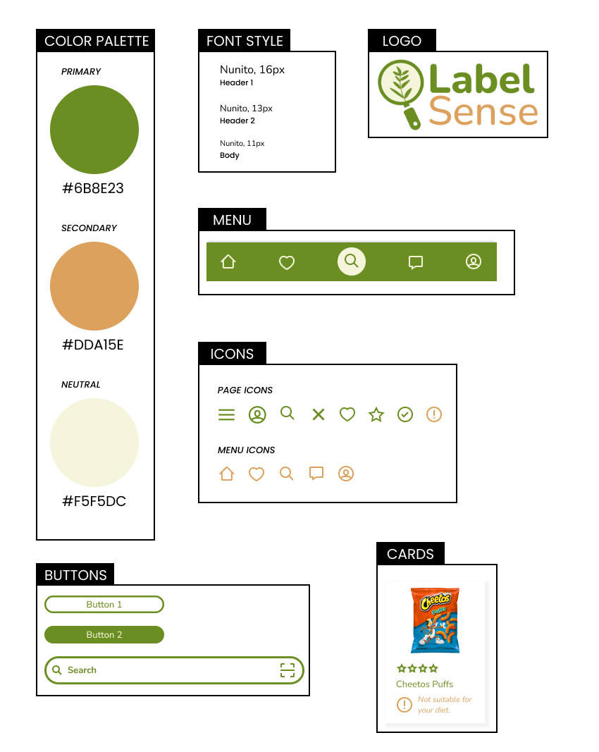
VISUAL DIRECTION
Color palette, font style, cards, logo, icons, buttons, menu
-
I kept natural/earth tone colors to connect to users looking for clean ingredients in their products.
-
I used a variety of icons to quickly bring attention to key information - if the product is suitable to the users dietary restrictions and nutritional information.
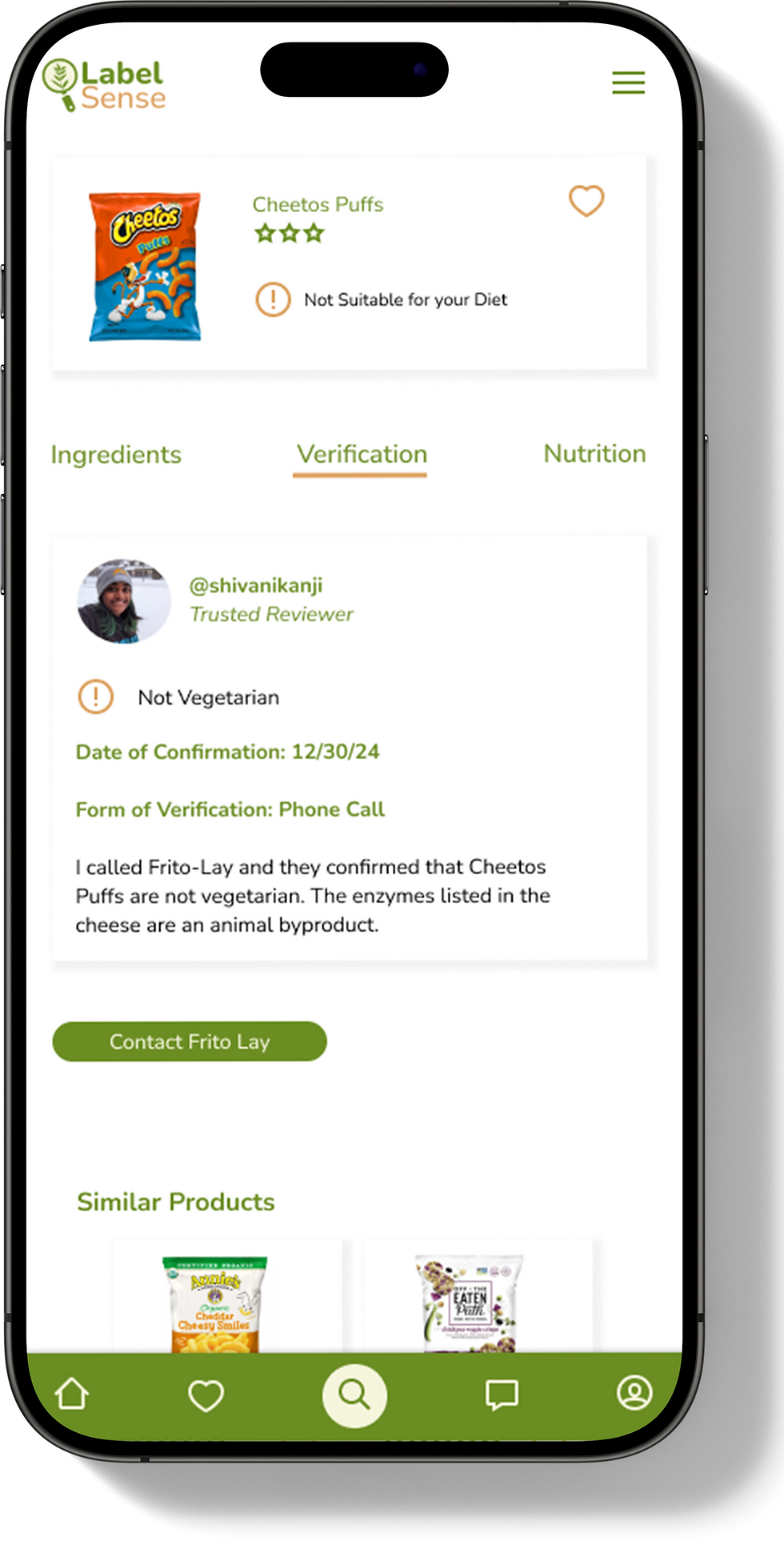
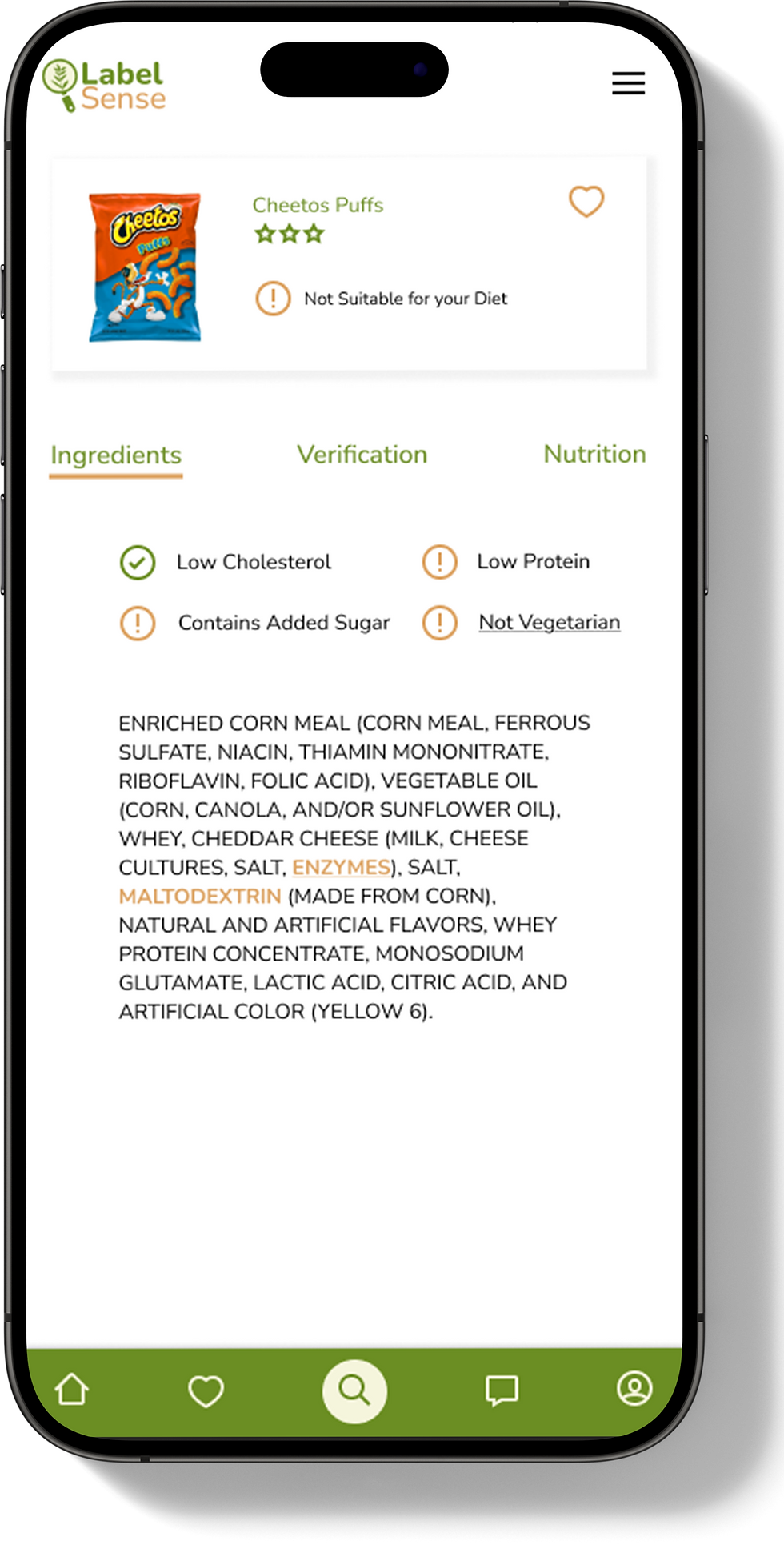
USER TESTING OF HIGH-FIDELITY WIREFRAMES
Incorporated UI design into the mid-fidelity wireframes and conducted user testing with those high-fidelity wireframes.
Conducted usability testing with 5 participants with the following tasks:
-
Log into the app.
-
Search for Cheetos Puffs and see if they are vegetarian friendly, showing verification.
-
Update your dietary restriction preferences to include high protein.


High Priority:
-
Remove verification popup and move that information to the verification tab
-
Change order of the tabs - ingredients, verification, nutrition
-
Dietary restriction details should be listed on top of the ingredients instead of on the verification tab
-
Make the highlighted ingredients clickable and have them link to verification
REFINING THE DESIGN
Summary of changes implemented based on feedback from usability testing:


Medium Priority:
-
Make the transition from the “edit” page more seamless when you click the button to fill in the circle
-
Make the words, not just the radio buttons clickable when editing preferences
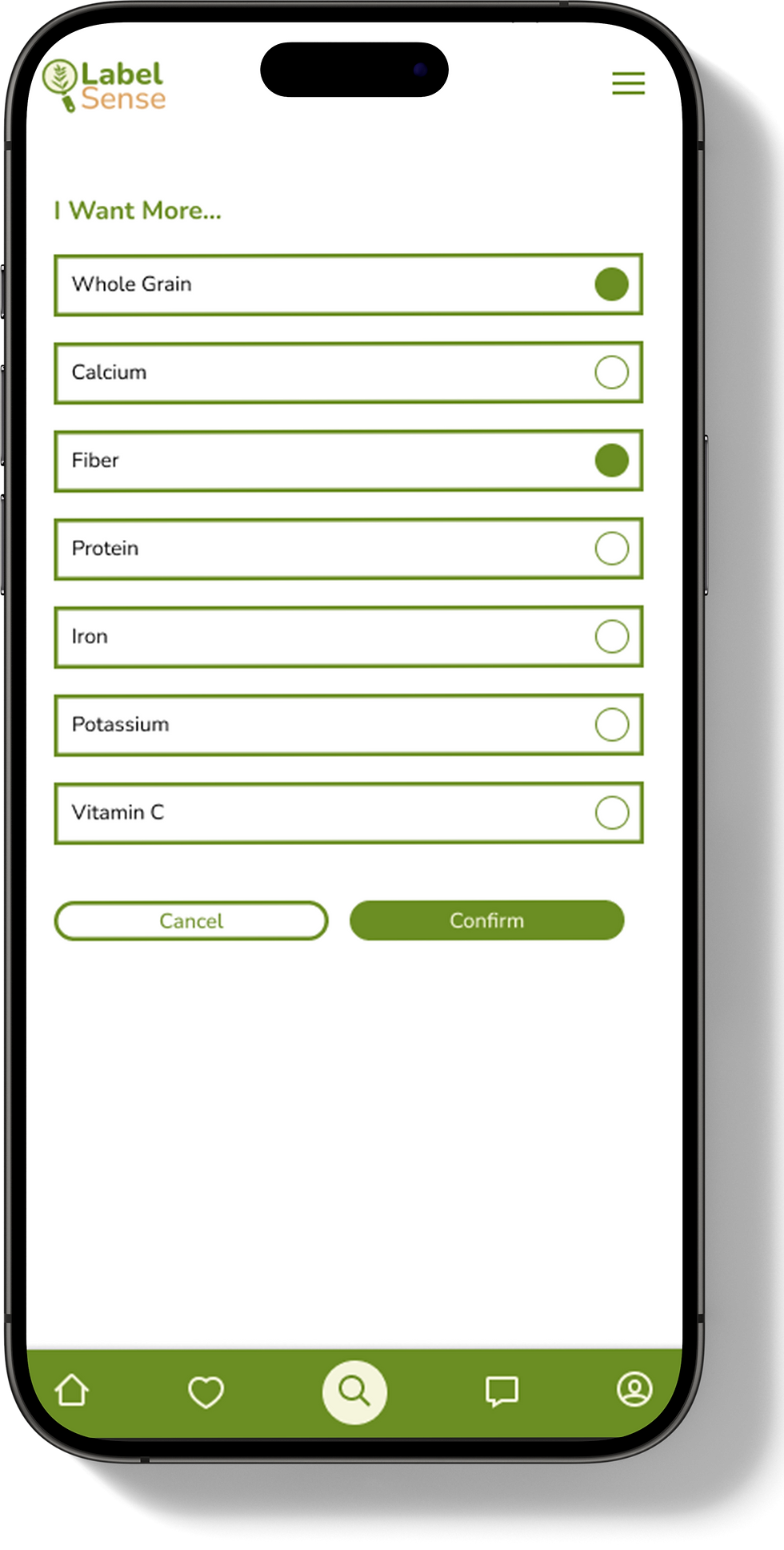
Updates made on prototyping.
Low Priority:
-
Change the word “account” to “preferences” in the menu
-
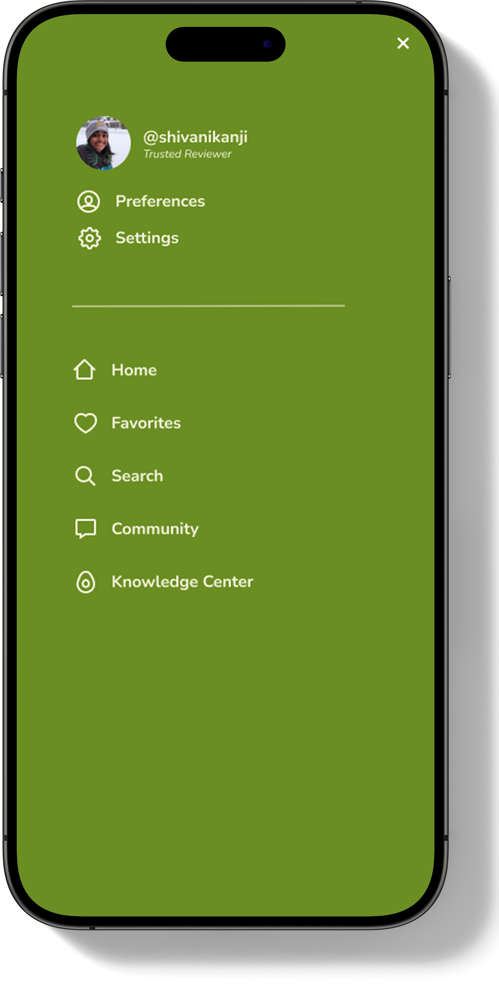
On the menu, move account and settings to under the username
-
Add a button to the knowledge center on the home page, maybe under “how it works


Learnings & Next Steps
Learnings
-
Conducting user interviews with the right demographic is very important to help understand if the product or a feature is necessary (or not)
-
Less is more. Adding a popup for users to see additional verification (from other users) made it a little more complicated than it needed to be. Based on user testing feedback, I was able to combine screens to make it more clear
Next Steps
-
Build out the remaining pages/features
-
Work with a software engineer to to map out the UX flow for integrating a product database into search, ensuring a seamless user experience