Completed as part of a UX design bootcamp in collaboration with a real client. Select designs were implemented.
ROLE
UX Researcher
UX Designer
TIMELINE
2 Weeks
Solo project
TOOLS
Figma
SKILLS
-
User research
-
UX design
-
Information architecture
-
Wireframing, prototyping, user testing
THE PROBLEM
L2D2 Design Studio provides a lot of services. Right now the website can be quite overwhelming, and it does not convey what their main services are.
The main user of the site is parents, while the website does seem kid-friendly, some aspects could be more targeted towards parents.
THE SOLUTION
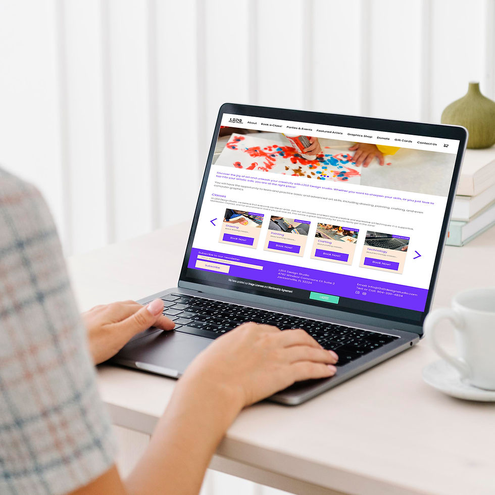
Redesign the key pages of the L2D2 Design Studio website so that users can easily complete main tasks.
It does not all need to be laid out on the homepage. It should be easy for users to book appointments/sign up for classes. A donation option for events is also a requested feature from the client.
RESEARCH GOAL
We want to know what services from L2D2 Design Studio that users are most interested in so that we can make it easy for users to find and book the services they are interested in.
Through research, I wanted to determine:
-
What features from the existing website do users find most useful?
-
What new features would users like to see?
-
How can the information architecture be updated to make it easier for users to find thing?
COMPETITIVE ANALYSIS
Comparative and competitive research helped to see how similar studios highlight their services and allow users to book.
-
Each competitor provides a unique experience/event. It is important to highlight what makes the experiences different.
-
Most competitors provides some form of online booking.
-
Based on marketing from competitors, we know users are looking for a social experience as well when attending a class/event.

Art League of Jacksonville
Promote and support visual arts through exhibitions, community events, and educational programs.

Painting with a Twist
Art classes where customers can paint along with instructors while enjoying drinks in a fun, social setting.

Pinspiration
Crafting Studio offering birthday parties, family activities, paint and sip, paint nights, corporate events, and more.

Creative Grain Studio
Crafting classes, mainly wood
SURVEY
Survey helped to understand who our users are and if we are creating something that will be useful for them.
3 respondents
Based on survey results, users are looking for:
-
A place for their children to explore their creativity
-
A place for social experiences
-
Classes that will enhance their children’s art skills.
-
A clear understanding of pricing for each class before they book
INTERVIEWS
User interviews helped to understand how users look for services and book services/events they are interested in.
5 participants
Affinity mapping based on user interviews helped highlight pain points, needs, and opportunities and helped me uncover how to categorize classes and what filters users want to search for classes by.
I decided to use the following categories:
-
Drawing
-
Painting
-
Crafting
-
Technology
-
Seasonal Classes
-
Tutoring Classes
-
Special Events
I decided to focus on the following filters:
-
Age Range
-
Difficulty
-
Price Range
-
Class Length

AUDIENCE PROFILES


USER FLOW + TASK FLOWS
By identifying needs and pain points during my research, I was able to focus on focus on how users are searching what they need - specific classes/events.
User flow laid out the steps users take as they go through the website. Task flow laid out the steps users take within the website in order to complete specific tasks, which helped to decide which pages would need to be built out for this project.


LOW-FIDELITY WIREFRAMES
By sketching out low-fidelity wireframes (rather than starting with a digital wireframe), I was able to focus on ensuring that all of the features I needed to include were properly built out, rather than being distracted by visuals.


MID-FIDELITY WIREFRAMES
As I began to layout the wireframes, I decided to make the following changes:
-
Insert booking form to the bottom of the class details page (add to cart) rather than having it as a separate page
-
Remove donation form page, link donation button to the existing form


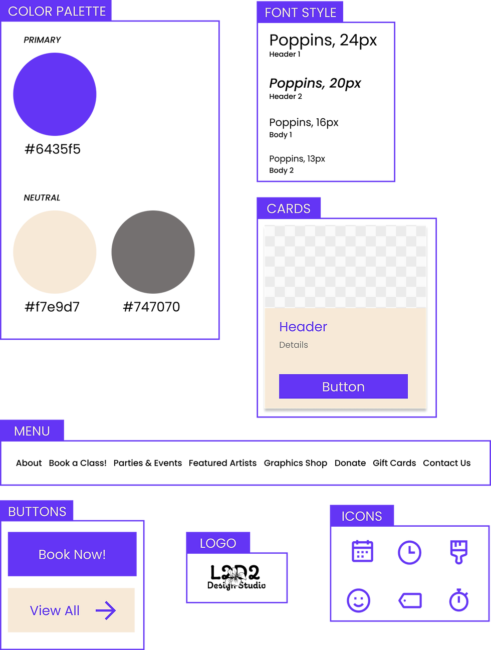
VISUAL DIRECTION
Color palette, font style, cards, logo, icons, buttons, menu
-
I kept the primary color from the original website (#6435f5), but also added a neutral color (#f7e9d7)
-
I used a variety of icons to quickly bring attention to important information about each class (price, time, etc)
USER TESTING OF MID-FIDELITY WIREFRAMES
Based on testing of the mid-fidelity wireframes with 3 participants, I focused on the following changes:
-
Increase fonts overall
-
Add “Gift Card” page to menu
-
Add options of amounts to donate on donate page
-
Add search button to classes page
-
Add “back to classes button to the individual class pages
-
Update verbiage:
-
Add a blurb about cost of supplies
-
Make seasonal pricing information more clear
-
Booking form title
-
USER TESTING OF HIGH-FIDELITY WIREFRAMES
Incorporated UI design into the mid-fidelity wireframes and conducted user testing with those high-fidelity wireframes.
Conducted usability testing with 5 participants with the following tasks:
-
Find out what the age level is for the “Drawing I” class.
-
Book the “Drawing I” class for this coming Monday.
-
Make a donation towards the art studio.
-
Start the process to book the venue for a party.


Learnings & Next Steps
Learnings
-
Early testing is important. I had a lot of takeaways from my initial testing of the mid-fidelity wireframes
-
Condensing/combing pages/features can help to make things more streamlined
Next Steps
-
Share and review the UI kit and prototype with the client
-
Build out other existing pages to match the UI of the new page