ROLE
UX Researcher
UX Designer
UI Designer
TIMELINE
6 Weeks
Solo project
TOOLS
Figma
SKILLS
-
User research
-
UX + UI design
-
Information architecture
-
Wireframing, prototyping, user testing
THE PROBLEM
Planning an event can seem like a daunting task, even if it is a small event for people you know.
There are many aspects to consider, from location and menu to guest list and communication with guests. This requires a lot of organization.
THE SOLUTION
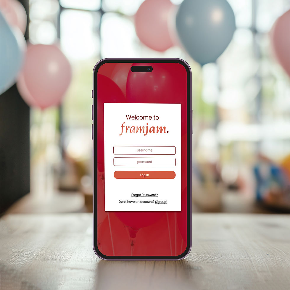
FramJam is a (mobile first) website that helps plan small events for family/friends.
Streamline the planning process by helping organize and collaborate on tasks and ideas through checklists and mood boards.
RESEARCH GOAL
We want to know the mindset of our party-planning users so that we can see how they organize/categorize the content and features of the product in a way that will help to streamline the planning process.
Through research, I wanted to determine:
-
Is this product useful to users?
-
Is there already a product like this in the market?
-
What features will be most useful for users?
COMPETITIVE ANALYSIS
Comparative and competitive research helped to see what tools are currently available to users and what features they have.
While all competitors provide tools to create and send invites, and most also provide tools to track RSVPs, they don’t provide any other planning tools in one platform. Based on feedback about competitors, it is important to have a good library of invitation templates that are fully customizable.
Paperless Post
Digital invitations and cards for various occasions, allowing you to manage guest list
Evite
Creating and sending digital invitations, allowing you to manage guest list

Facebook Events
Create, manage, and promote events on Facebook
Punchbowl
Customized digital invitations and party planning resources tailored for family events and celebrations
SURVEY
Survey helped to understand who our users are and if we are creating something that will be useful for them.
Based on survey results, I was able to create a full list of possible features:
-
budgeting
-
guest list
-
theme/decoration ideas
-
activity ideas
-
menu ideas + planning
-
collaboration
INTERVIEWS
User interviews helped to understand how users plan events, what tools they use, and what their main pain points are.
Affinity mapping based on user interviews helped highlight pain points, needs, and opportunities and helped me uncover what features I should focus on. Based on the affinity mapping, I decided to focus on the following features:
-
menu/food
-
activities/things to do
-
theme/decoration
AUDIENCE PROFILES
USER FLOW + TASK FLOWS
By identifying needs and pain points during my research, I was able to focus on specific features and this helped streamline navigation.
User flow laid out the steps users take as they go through the website. Task flows helped to decide which pages would need to be built out for this project.
LOW-FIDELITY WIREFRAMES
By sketching out low-fidelity wireframes (rather than starting with a digital wireframe), I was able to focus on ensuring that all of the features I needed to include were properly built out, rather than being distracted by visuals.
MID-FIDELITY WIREFRAMES
After sketches, I was able to transfer the wireframes into digital wireframes, as mid-fidelity wireframes. This helped me focus on the layout and usability over the UI and branding aspects.
Wireframes were broken down by task. This helped to make sure that there was no break in the flow in order to complete the task.
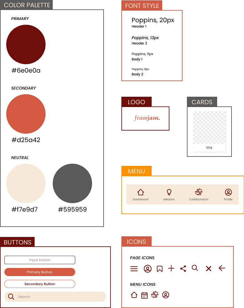
VISUAL DIRECTION
Color palette, font style, cards, logo, icons, buttons, menu
-
Originally, I had orange as a primary color, but as I started creating the high-fidelity wireframes, I realized it was too vivid of a color. So, I decided to keep only one primary color, and remove orange from the palette completely.
-
As I worked on the high-fidelity wireframes, there were places that needed more focus, and so I had to add cards to the component library.
-
I originally only had one button option, but as I started creating the high-fidelity wireframes, I saw the need for a secondary button.
-
I created one original icon (the collaboration icon) to match the look of all of the other icons.
USER TESTING OF HIGH-FIDELITY WIREFRAMES
Incorporated UI design into the mid-fidelity wireframes and conducted user testing with those high-fidelity wireframes.
Conducted usability testing with the following tasks:
-
Log into the website
-
Search for “kid’s birthday party” decoration ideas, and save the “Dinosaurs” theme idea to the “Themes” board on your mood board.
-
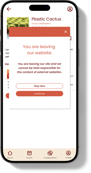
Purchase the “Plastic Cactus” decoration material from the “Cactus Centerpiece” decoration idea that you have saved for “Kara’s Baby Shower”.
-
Share the ingredients shopping list for “Kara’s Baby Shower”.
High Priority:
-
Updated all search buttons to navigate to the same page with the filled option.
-
Locked the position of the header - menu and search bar
-
Changed events and collaboration icons to make more sense, and changed color to darker option
REFINING THE DESIGN
Summary of changes implemented based on feedback from usability testing:


Medium Priority:
-
Adjusted position of save icons


Low Priority:
-
Built out the menu
-
Made more cards clickable

Learnings & Next Steps
Learnings
-
The first wireframes should always be sketched rather than digital, this makes it faster to make adjustments.
-
It is important to update and refine ideas, based on research and feedback. In order to do this effectively, it is also important to prioritize changes.
-
Update layer titles as you design; it is important to keep layers organized.
Next Steps
-
Build out remaining pages - activities, collaboration, etc.
-
Add alt tags to make the app more accessible
-
Work with a software engineer a to refine collaboration and sharing features while exploring AI-driven enhancements for search to improve usability


