ROLE
UX Researcher
UX Designer
UI Designer
TIMELINE
3 Weeks
Solo project
TOOLS
Figma
SKILLS
-
User research
-
UX + UI design
-
Information architecture
-
Wireframing, prototyping, user testing
THE PROBLEM
Unless you plan well in advance, it is hard to get a group of seats together at the movie theater in an optimal viewing area.
It takes a lot of communication outside of the app to coordinate seats with the group.

THE SOLUTION
Design a user-friendly app where moviegoers can reserve seats for a group and send the reservation to the group for everyone to purchase their own tickets within an allotted time frame.
RESEARCH GOAL
We want to know what users need to make the best movie theater ticket purchases so that we can make the ticket purchasing process easy and effective.
Through research, I wanted to determine:
-
Is this product useful to users?
-
Is there already a product like this in the market?
-
What features will be most useful for users?
COMPETITIVE ANALYSIS
Comparative and competitive research helped to understand what features are missing from existing movie ticketing apps.
Opportunities I identified based on features not offered by other movie ticketing apps:
-
Offer a way to see reviews and compare movies
-
Offer a way to put seats on hold and contact others so that individuals in a group can purchase their own tickets, but still get seats together

AMC
Sells tickets for showings at their specific locations on their app and website (includes a convenience fee for online tickets/seat reservations) as well as in person.

Fandango
Sells tickets online for most theaters (includes a convenience fee for online tickets/seat reservations)

MoviePass
Subscription-based. You get a certain amount of credits each month based on your subscription which you can then use to redeem for movie tickets at participating theaters.

Cinemark
Sells tickets for showings at their specific locations on their app and website (includes a convenience fee for online tickets/seat reservations) as well as in person.
INTERVIEWS
User interviews helped to understand what additional features users are looking for to help make the ticketing process easier.
I interviewed several people to get an understanding of pain points as well as what features users would use in a movie ticketing app. I also conducted interviews with a different group of people after the prototype was created to get an understanding how they would use the app and how to make it more user-friendly.
Through my research, I realized that my assumptions about the chat feature were not correct and that piece needed to simplified. I also realized I was missing a few key pages in my prototype.
Pain points discovered from user interviews:
-
It takes a lot of communication to get a group together to watch a movie in a theater.
-
It is hard to get good seats together for a large group if you don’t buy tickets well in advance.
-
It is sometimes easier for one person to buy tickets for the whole group, but splitting the cost at the end can be annoying.
-
By the time you wait for the whole group to purchase tickets, sometimes the seats you want are taken.
AUDIENCE PROFILES


TASK FLOW

LOW-FIDELITY WIREFRAMES
Movie Info Page
When creating the movie info page, I wanted to make sure that it had all of the information that someone would need to choose a movie, but it still had a clean look where they could easily find what they are looking for.


MID-FIDELITY WIREFRAMES
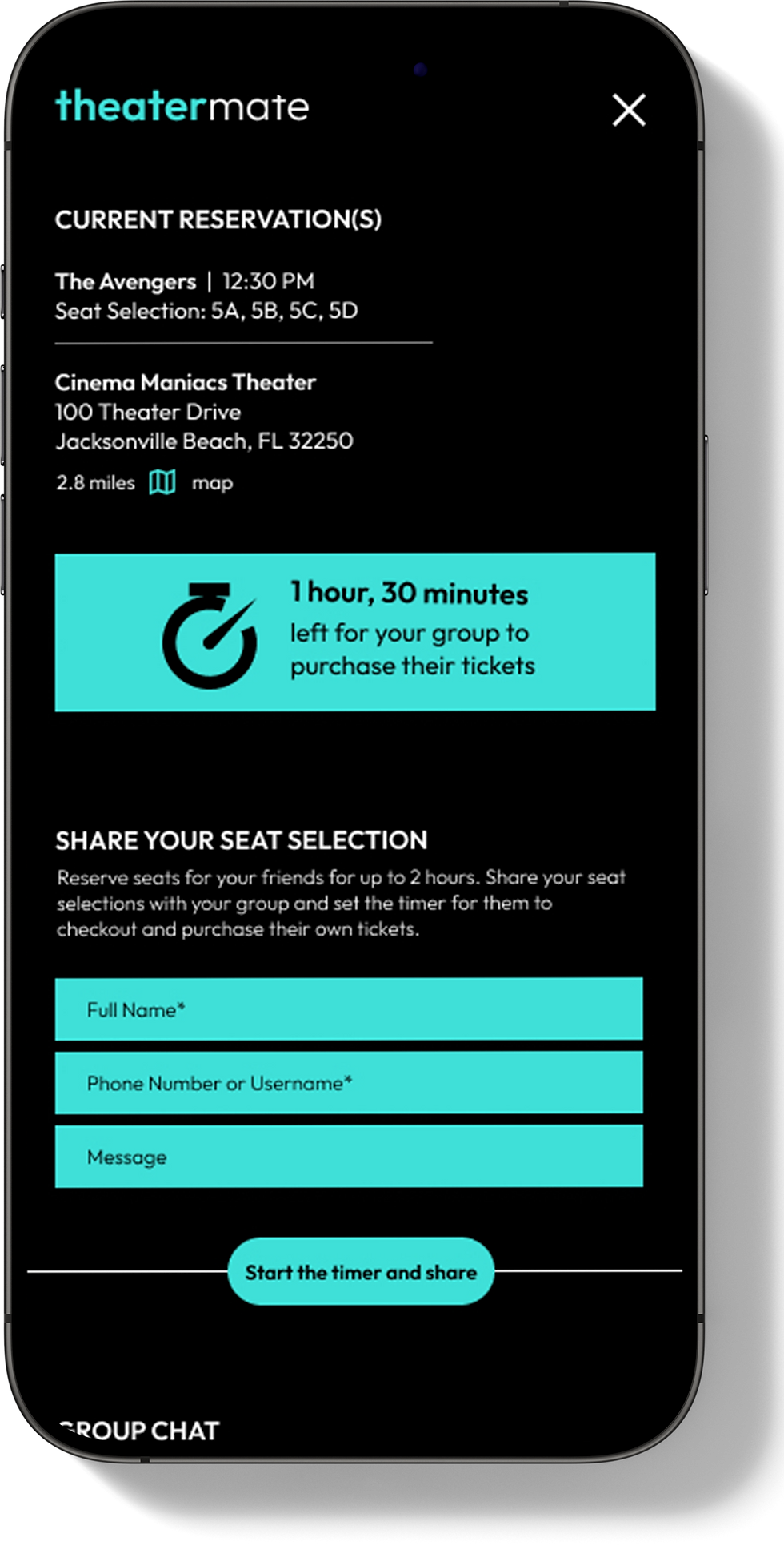
Share Page
Through my research, I realized that users want an easy way to communicate with a group and for the entire group to purchase tickets. In my wireframe, I wanted to makes sure these elements were easy to use, but still effective.

Movie goers can go ahead and reserve seats for a group, and adding a timer feature makes sure they have it open for a long enough period of time, and it gives the group a time limit to make a decision and purchase their seats.
Adding a chat element makes it easier for movie goers to communicate with their group and make decisions.

VISUAL DIRECTION
Color palette, font style, cards, logo, icons, buttons, menu
-
I noticed that many theater brands use red as their primary color, so I wanted to stay away from red so it doesn't seem like this is a theater brand.
-
I wanted a clean font that is legible, even with a lot of text on a screen. Especially for the pages that display all the show times.
-
Most entertainment apps have a dark UI, so I updated the design to have a dark UI.
USER TESTING OF WIREFRAMES
Low-Fidelity Wireframe Testing:
5 participants:
-
“Profile” page had too many buttons that aren’t needed
-
Additional pages need: movie selection, review form
-
Headers needed to include a way to go back or exit a page
High-Fidelity Wireframe Testing:
3 participants:
-
“Share” page needed to be simplified to make it more clear/easy to use
-
Needed to remove “snack” options; it didn’t work for all theaters
-
There was no price breakdown on the checkout page
REFINING THE DESIGN
Summary of changes implemented based on feedback from usability testing:
Share Page:
-
Had the movie information populate from the selection and removed the movie and seat selections from the top
-
Made the timer more clear
-
Make the forms for sharing seat selection and starting a chat more clear

Checkout Page:
-
Added more detailed ticket information at the top
-
Added a more clear cost breakdown in the summary
-
Removed “snack” options
-
Removed the footer
-
Cleaned up the payment form with two columns


Accessibility Considerations
-
The colors were run through the 508 color contrast check to ensure that they were WCAG AAA compliant.
-
Content is organized in a logical and hierarchical manner, which allows screen reader users to navigate through a page more efficiently.
-
For any gestures used, there is another option such as a back button or cancel button.


Learnings & Next Steps
Learnings
I learned how small changes can make a big impact. For example, the slightest change in font/color or size of a button can make a big impact on accessibility. Sometimes changing the verbiage slightly or condensing verbiage into buttons, dropdowns or forms can make things a lot more clear for the user.
Next Steps
-
Work with software engineer to improve the functionality and user experience of the chat, share, and seat selection forms
-
Add alt tags to make the app more accessible
-
Experiment with interaction options to refine the app’s flow, focusing on smoother transitions and intuitive gesture